Pamplemousse
Pamplemousse
Pamplemousse
Redesigning a clean beauty brand for Gen- Z
Redesigning a clean beauty brand for Gen- Z
ROLE
Product Designer
DURATION
Jan - Mar 2026
TOOLS
Figma
Figma Jam
MidJourney
Photoshop
About
About
Pamplemousse is a French beauty e-commerce brand designed for Gen Z, that focuses on cruelty-free cosmetics.
Pamplemousse is a French beauty e-commerce brand designed for Gen Z, that focuses on cruelty-free cosmetics.

The Problem
The Problem
"The brand had the right values but the wrong energy”
"The brand had the right values but the wrong energy”
The old site felt clinical and safe but also had a huge disconnect from the bold, expressive Gen Z audience it was designed for. The redesign aimed for an experience that match the brand's true personality.
The old site felt clinical and safe but also had a huge disconnect from the bold, expressive Gen Z audience it was designed for. The redesign aimed for an experience that match the brand's true personality.

User research
User research
What was missing from the current website beyond its visuals ?
What was missing from the current website beyond its visuals ?
Before redesigning anything I spoke to 12 people aged 18 - 30 to understand their actual experience with the existing site which led me to uncover 3 major issues.
Before redesigning anything I spoke to 12 people aged 18 - 30 to understand their actual experience with the existing site which led me to uncover 3 major issues.
Insight 1: Users couldn't navigate by values
Insight 1: Users couldn't navigate by values
One of the most important aspect of a clean brand is their values. In this case, users already knew what product they wanted when coming into the site however they couldn’t filter it down to what they were actually looking for as far as value without having to read long product descriptions.
One of the most important aspect of a clean brand is their values. In this case, users already knew what product they wanted when coming into the site however they couldn’t filter it down to what they were actually looking for as far as value without having to read long product descriptions.

Insight 2: Purchase anxiety before checkout
Insight 2: Purchase anxiety before checkout
During the testing phase when doing my research, i also quickly noticed that before finalizing a purchase most users would usually leave the website to go on socials platform like snapchat, youtube... and search the product name to get validation before checking out. A source from Exverus by brainlabs / Forbes Advisor 2024/2025 also leaned into that behavior.
During the testing phase when doing my research, i also quickly noticed that before finalizing a purchase most users would usually leave the website to go on socials platform like snapchat, youtube... and search the product name to get validation before checking out. A source from Exverus by brainlabs / Forbes Advisor 2024/2025 also leaned into that behavior.

Insight 3 : Users wanted the possibility to choose within aesthetic context
Insight 3 : Users wanted the possibility to choose within aesthetic context
Although the current site had a “shop by category” section , a few user expressed that they would love to have the possibility to also choose by “aesthetic” stating that it could be easier for someone new into makeup rather than having to search the whole site and figure it out on their own.
Although the current site had a “shop by category” section , a few user expressed that they would love to have the possibility to also choose by “aesthetic” stating that it could be easier for someone new into makeup rather than having to search the whole site and figure it out on their own.

User Personas
User Personas
“ Knowing the user and their journey”
“ Knowing the user and their journey”
After gathering the insights during the user research, i created a persona and a journey map to fully understand the user needs and look for areas where i could also improve their experience when redesigning the site.
After gathering the insights during the user research, i created a persona and a journey map to fully understand the user needs and look for areas where i could also improve their experience when redesigning the site.

Design Direction
Design Direction
Matching the brand to its core personality
Matching the brand to its core personality
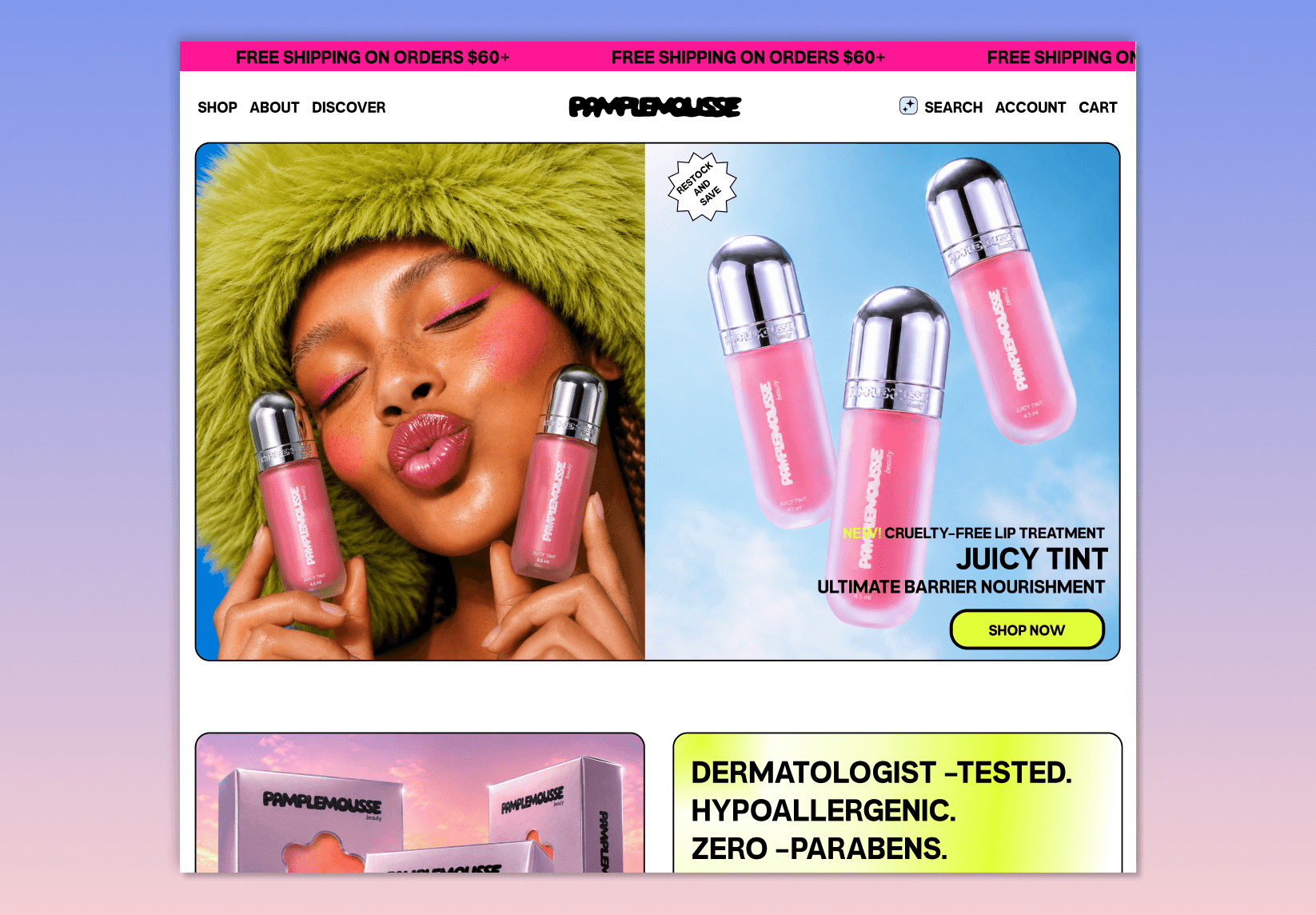
Knowing that the brand main target was Gen- z, I rebuild the entire visual identity leaning toward Nostalgic Y2K and created a logo that better align with the audience. The imagery was generated with Midjourney.
Knowing that the brand main target was Gen- z, I rebuild the entire visual identity leaning toward Nostalgic Y2K and created a logo that better align with the audience. The imagery was generated with Midjourney.

Hi-FI Wireframes
Hi-FI Wireframes
Making The Brand Recognizable
Making The Brand Recognizable
The first step was to rebuild the whole interface to match Pamplemousse's bold Gen Z identity essentially moving away from a the clinical look toward an editorial Y2K direction. Here are the results:
The first step was to rebuild the whole interface to match Pamplemousse's bold Gen Z identity essentially moving away from a the clinical look toward an editorial Y2K direction. Here are the results:

A Better Filtering system
A Better Filtering system
To fix the filtering issue, I introduced a way where users could also filter based on their specific mood and narrow it down to a specific values within that preferred category to help make the discovery seamless and less consuming.
To fix the filtering issue, I introduced a way where users could also filter based on their specific mood and narrow it down to a specific values within that preferred category to help make the discovery seamless and less consuming.


Confidence Before Checkout
Confidence Before Checkout
To reassure potential buyers, better descriptions were established on the product page along with adding embedded tutorials directly on the page to bring social proof , letting users see the product in real use before committing to purchase without them leaving the site.
To reassure potential buyers, better descriptions were established on the product page along with adding embedded tutorials directly on the page to bring social proof , letting users see the product in real use before committing to purchase without them leaving the site.

What success is like for Pamplemousse
What success is like for Pamplemousse
Success for Pamplemousse looks like a Gen Z shopper landing on the homepage and immediately feeling like the brand was made for them rather than stumbling onto another clinical beauty site. It looks like a user filtering by mood instead of category and discovering a product they would not have found otherwise. It looks like someone watching a tutorial on a skin tone that matches theirs and adding to cart with confidence instead of leaving the site to look if it would works. To validate these outcomes the next step would be usability testing with users to measure drop-off rates, filter engagement, and tutorial conversion to understand what is working and what might still needs refinement.
Success for Pamplemousse looks like a Gen Z shopper landing on the homepage and immediately feeling like the brand was made for them rather than stumbling onto another clinical beauty site. It looks like a user filtering by mood instead of category and discovering a product they would not have found otherwise. It looks like someone watching a tutorial on a skin tone that matches theirs and adding to cart with confidence instead of leaving the site to look if it would works. To validate these outcomes the next step would be usability testing with users to measure drop-off rates, filter engagement, and tutorial conversion to understand what is working and what might still needs refinement.
Get in touch
© 2026 Anne Tchoumba
Get in touch
© 2026 Anne Tchoumba
Get in touch
© 2026 Anne Tchoumba