Pamplemousse
Pamplemousse
Pamplemousse
A modern beauty e-commerce experience that facilitates products exploration
A modern beauty e-commerce experience that facilitates products exploration
ROLE
Product Designer
DURATION
Jan - Mar 2026
TOOLS
Figma
Figma Jam
Photoshop
About
About
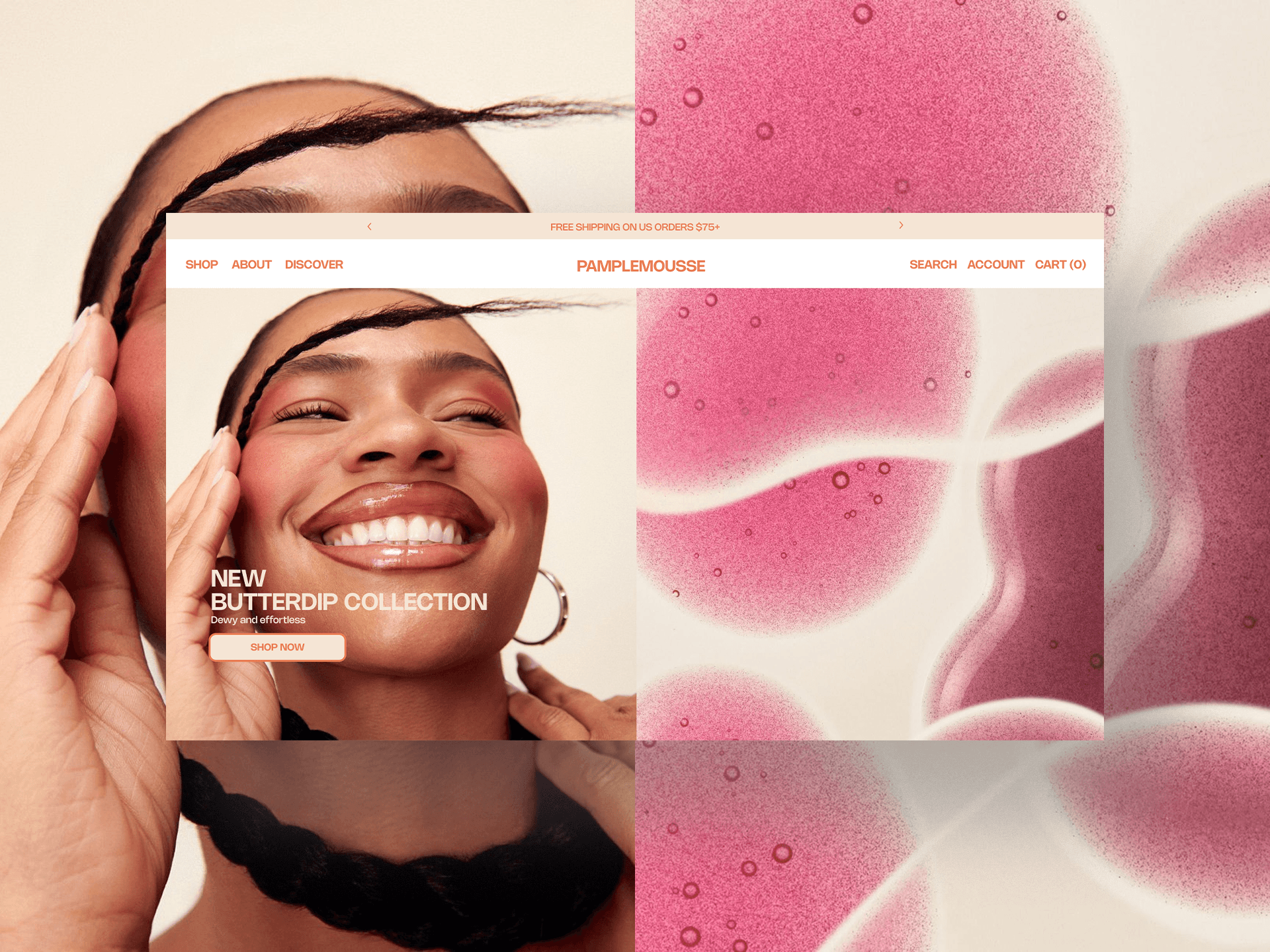
Pamplemousse (grapefruit in French) is a cruelty-free beauty brand concept. The goal was to create a modern e-commerce experience where users can easily explore and discover products.
Pamplemousse (grapefruit in French) is a cruelty-free beauty brand concept. The goal was to create a modern e-commerce experience where users can easily explore and discover products.
The Problem:
The Problem:
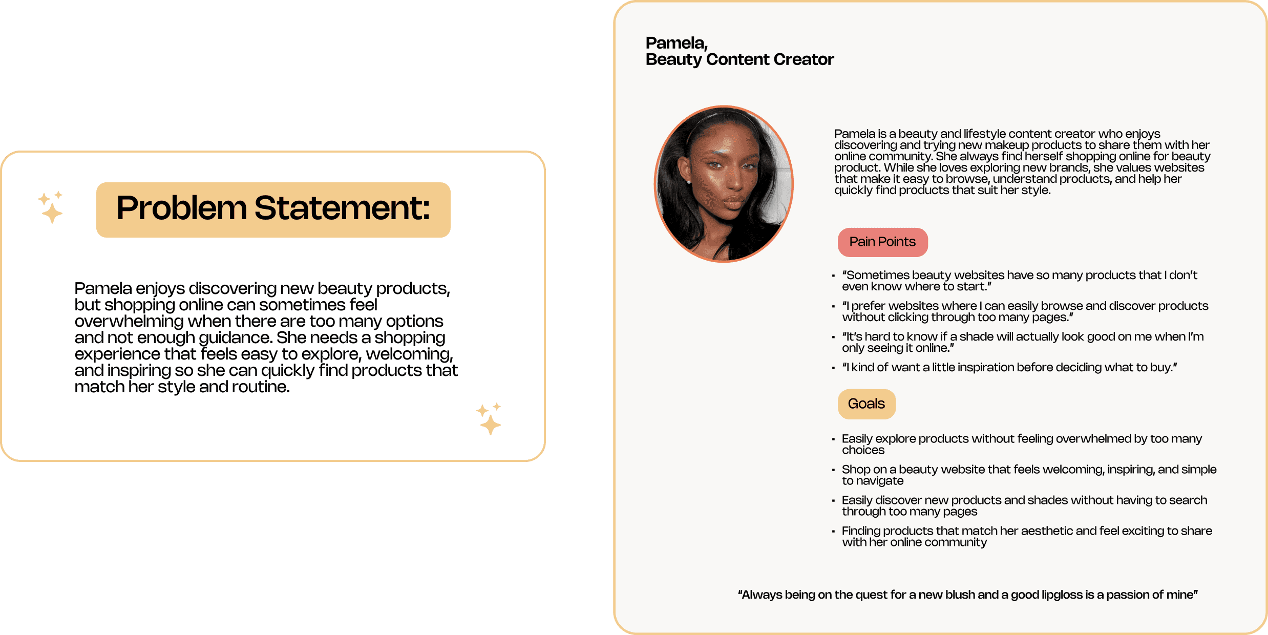
Many beauty e-commerce websites have a large catalog of products which may result in users not being able to find the right product right away when visiting a page, leaving them defeated.
Many beauty e-commerce websites have a large catalog of products which may result in users not being able to find the right product right away when visiting a page, leaving them defeated.
Many beauty e-commerce websites have a large catalog of products which may result in users not being able to find the right product right away when visiting a page, leaving them defeated.
User Research
User Research
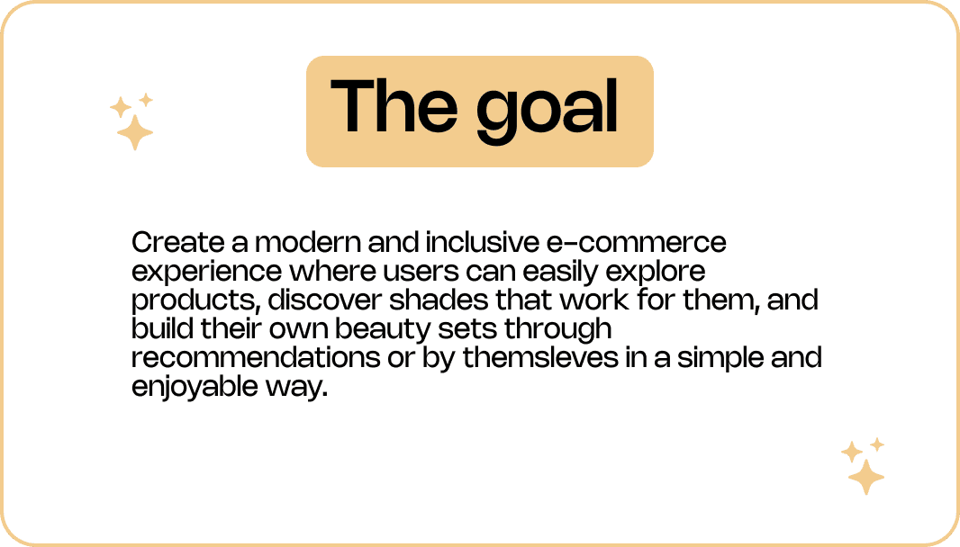
Knowing that navigating a website when shopping for a specific product should be hassle free, i went ahead and spoke with a few people who regularly shop for beauty products online to better understand their experiences.
Knowing that navigating a website when shopping for a specific product should be hassle free, i went ahead and spoke with a few people who regularly shop for beauty products online to better understand their experiences.
Knowing that navigating a website when shopping for a specific product should be hassle free, i went ahead and spoke with a few people who regularly shop for beauty products online to better understand their experiences.
Key Findings
Key Findings
While speaking with the participants, a few common themes started to appear. which help me guide my vision for Pamplemousse
While speaking with the participants, a few common themes started to appear. which help me guide my vision for Pamplemousse
While speaking with the participants, a few common themes started to appear. which help me guide my vision for Pamplemousse
User Personas
User Personas
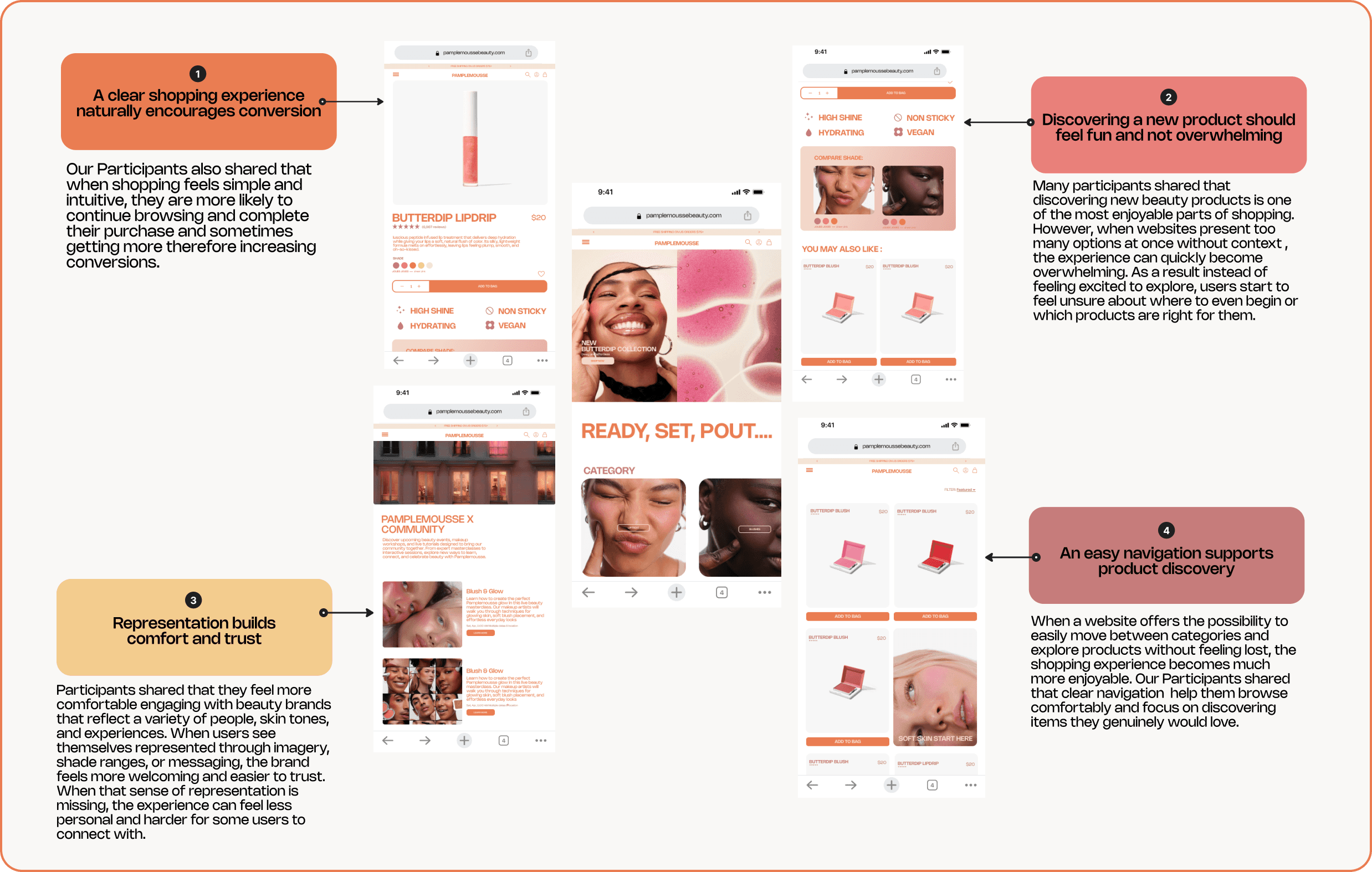
With the insights gathered from the participants i created a persona to further understand the needs of people shopping for beauty products online.
With the insights gathered from the participants i created a persona to further understand the needs of people shopping for beauty products online.
With the insights gathered from the participants i created a persona to further understand the needs of people shopping for beauty products online.
User Journey Map
User Journey Map
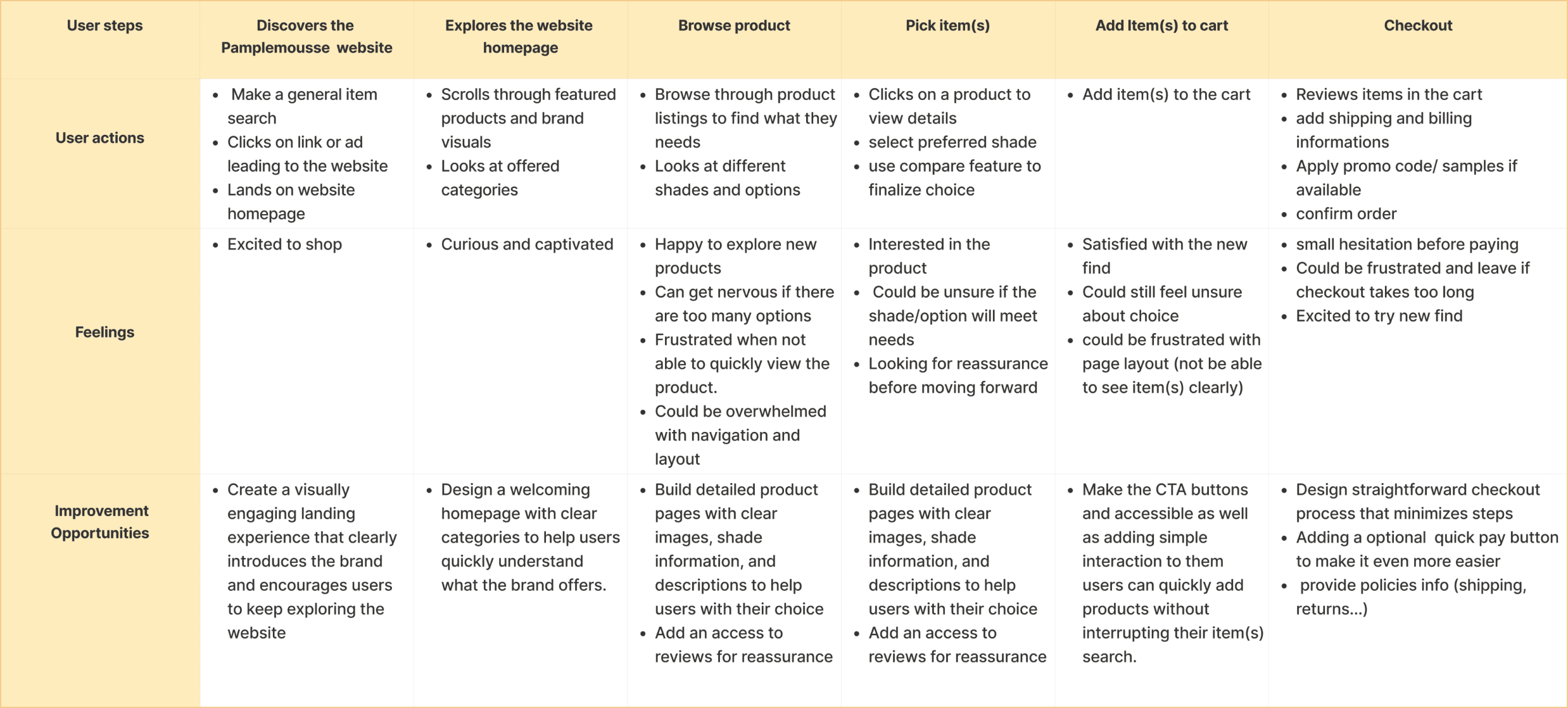
A user journey map was then created to identify moments where the experience could feel confusing or frustrating, as well as opportunities to design a more cohesive website.
A user journey map was then created to identify moments where the experience could feel confusing or frustrating, as well as opportunities to design a more cohesive website.
A user journey map was then created to identify moments where the experience could feel confusing or frustrating, as well as opportunities to design a more cohesive website.
Sitemap
Sitemap
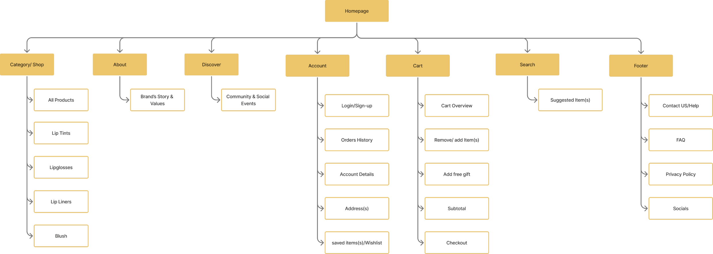
To organize the structure of the website i created a sitemap outlining the main pages and how they connect.
To organize the structure of the website i created a sitemap outlining the main pages and how they connect.
To organize the structure of the website i created a sitemap outlining the main pages and how they connect.
Paper Wireframes:
Paper Wireframes:
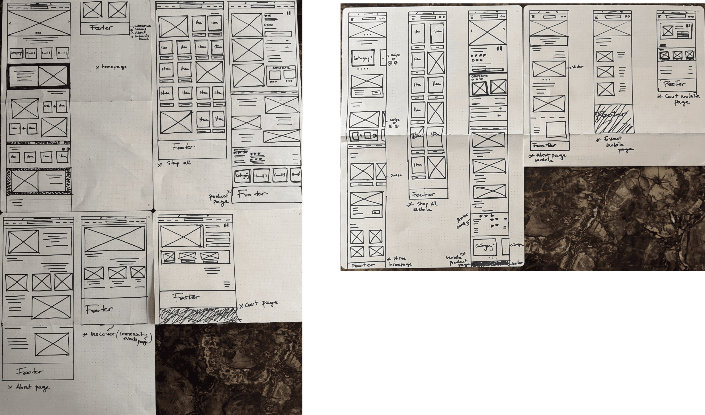
After the sitemap i began sketching my ideas on paper to map out the structure of the website and define the main sections across each page.
After the sitemap i began sketching my ideas on paper to map out the structure of the website and define the main sections across each page.
After the sitemap i began sketching my ideas on paper to map out the structure of the website and define the main sections across each page.
LO-FI Wireframes
LO-FI Wireframes
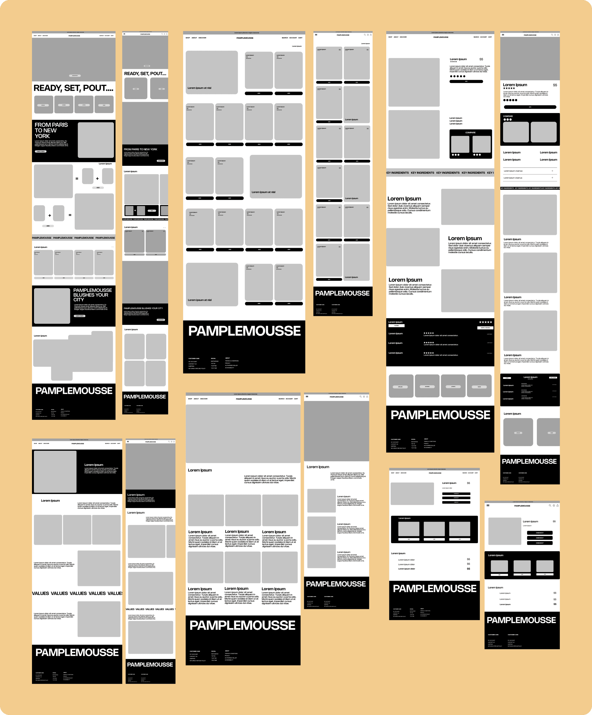
I then moved to making my screens to further refine the layout and structure of the website. This step allowed me to better define spacing, alignment, and hierarchy while ensuring consistency across different pages
I then moved to making my screens to further refine the layout and structure of the website. This step allowed me to better define spacing, alignment, and hierarchy while ensuring consistency across different pages
I then moved to making my screens to further refine the layout and structure of the website. This step allowed me to better define spacing, alignment, and hierarchy while ensuring consistency across different pages
UI Kits
UI Kits
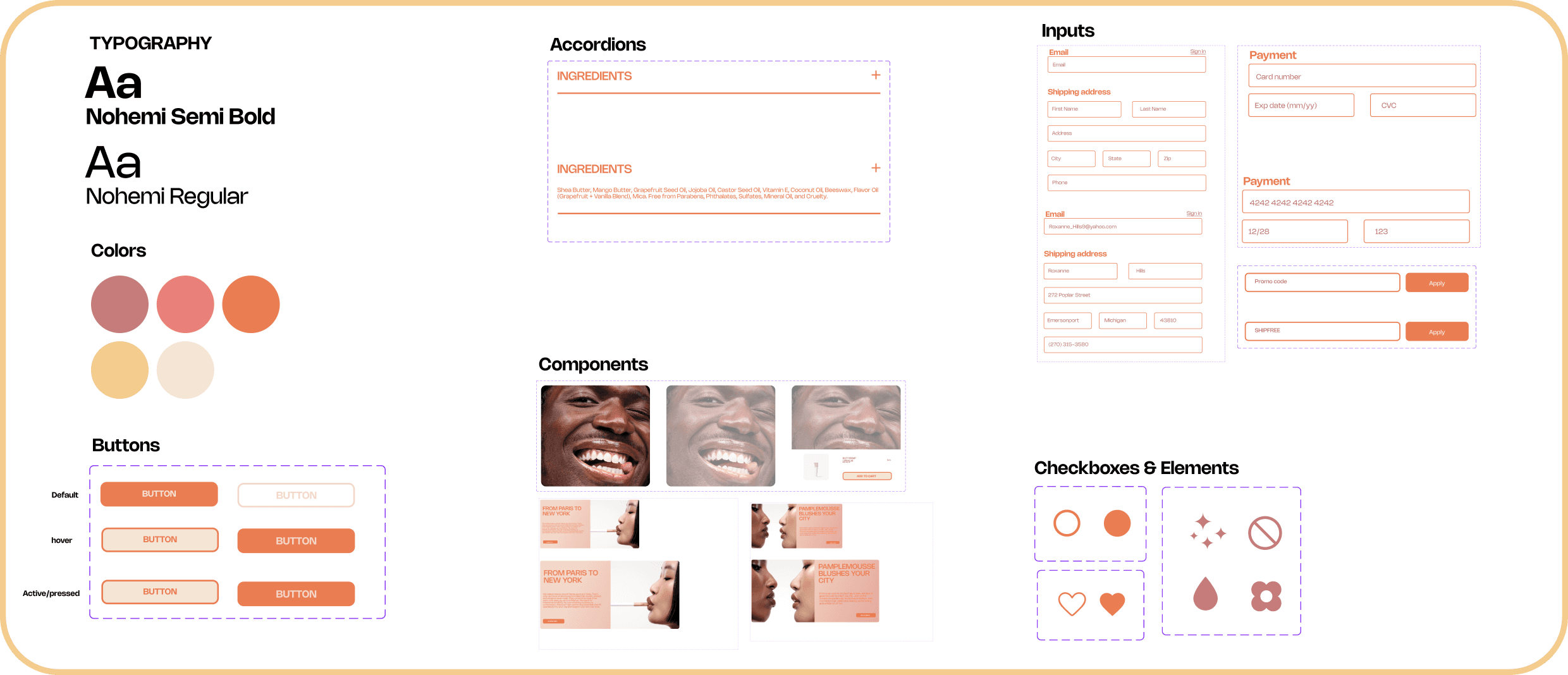
To maintain consistency across the website, I created a UI kit that defines the visual elements of the brand.
To maintain consistency across the website, I created a UI kit that defines the visual elements of the brand.
To maintain consistency across the website, I created a UI kit that defines the visual elements of the brand.
HI-FI Wireframes:
HI-FI Wireframes:
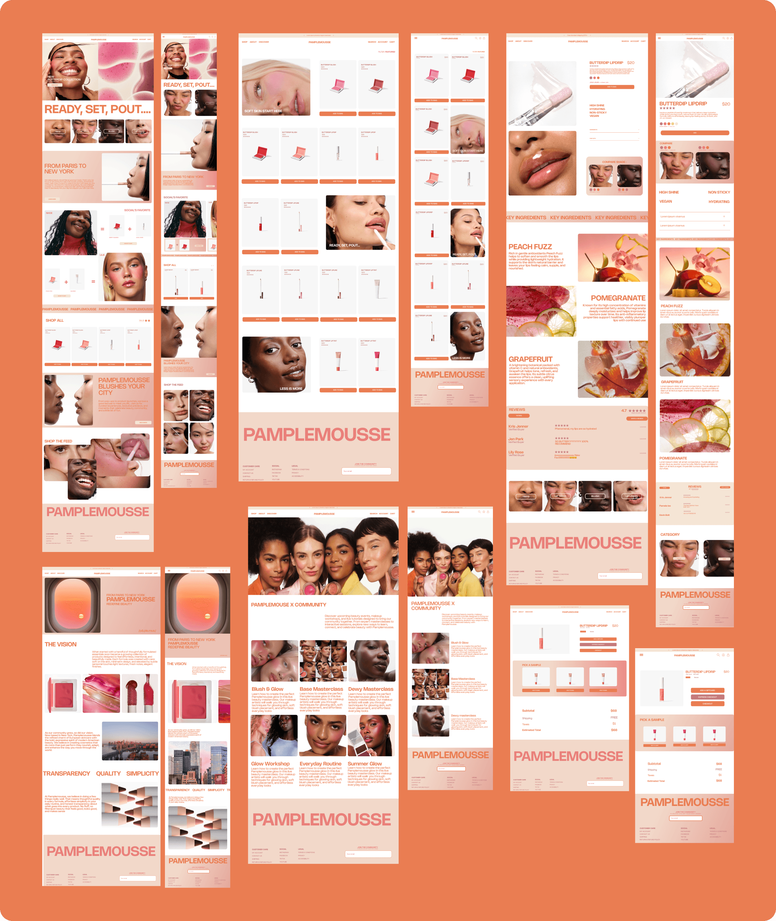
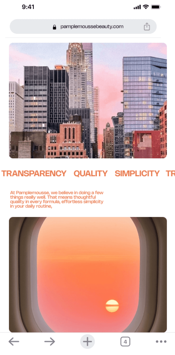
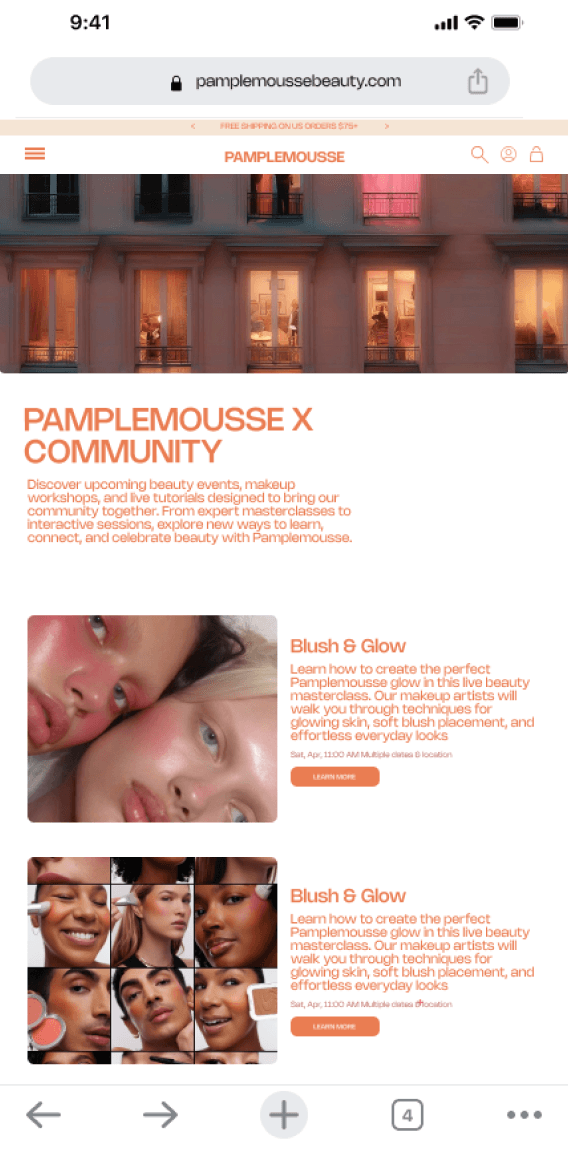
With the UI kit established, I moved into high-fidelity designs focusing on creating an interface that feels both engaging and easy to navigate.
With the UI kit established, I moved into high-fidelity designs focusing on creating an interface that feels both engaging and easy to navigate.
With the UI kit established, I moved into high-fidelity designs focusing on creating an interface that feels both engaging and easy to navigate.
Usability Study:
Usability Study:
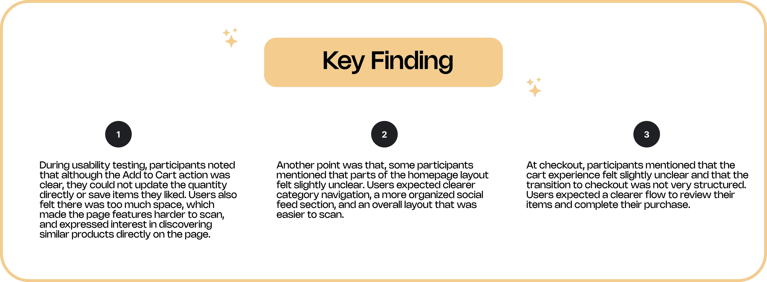
Once the Hi-Fi wireframes were completed, it was now time to evaluate the usability of the Pamplemousse website. To do so we conducted an unmoderated study to understand how easily users could navigate the interface, explore products, and complete a purchase.
Once the Hi-Fi wireframes were completed, it was now time to evaluate the usability of the Pamplemousse website. To do so we conducted an unmoderated study to understand how easily users could navigate the interface, explore products, and complete a purchase.
Once the Hi-Fi wireframes were completed, it was now time to evaluate the usability of the Pamplemousse website. To do so we conducted an unmoderated study to understand how easily users could navigate the interface, explore products, and complete a purchase.
Iteration 1
Iteration 1
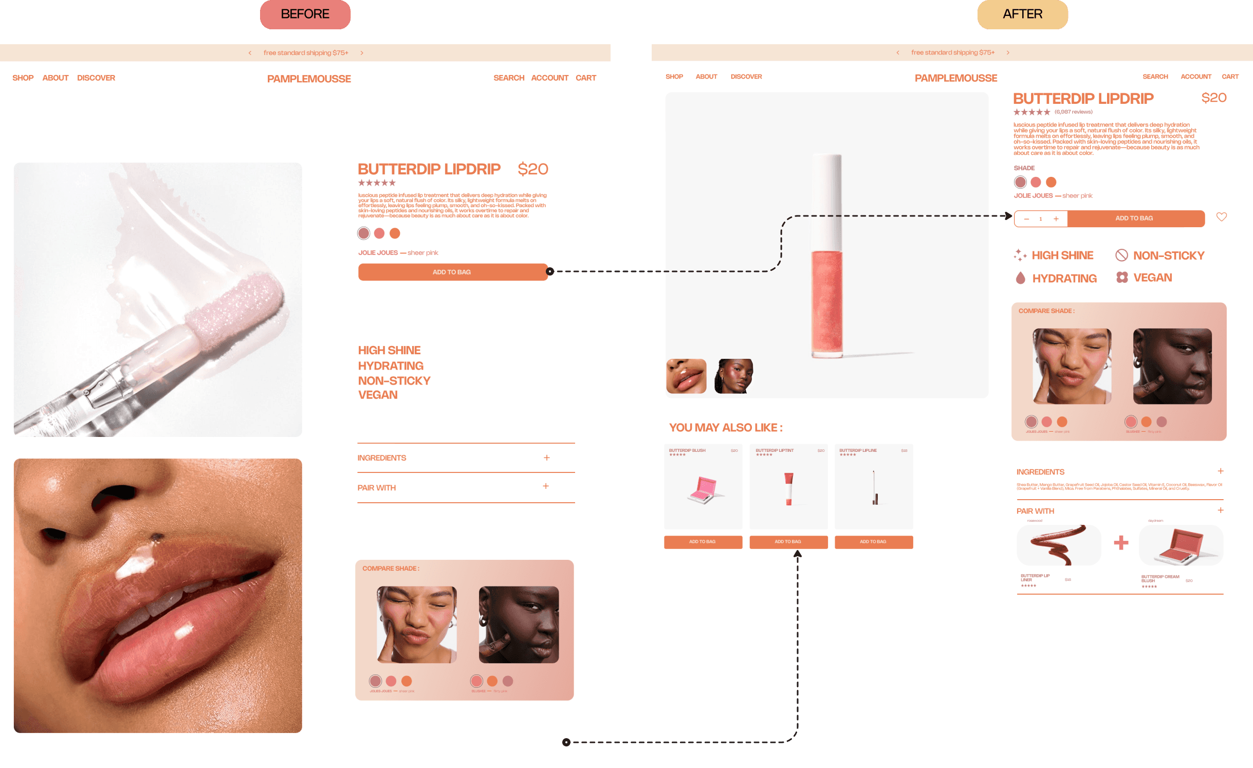
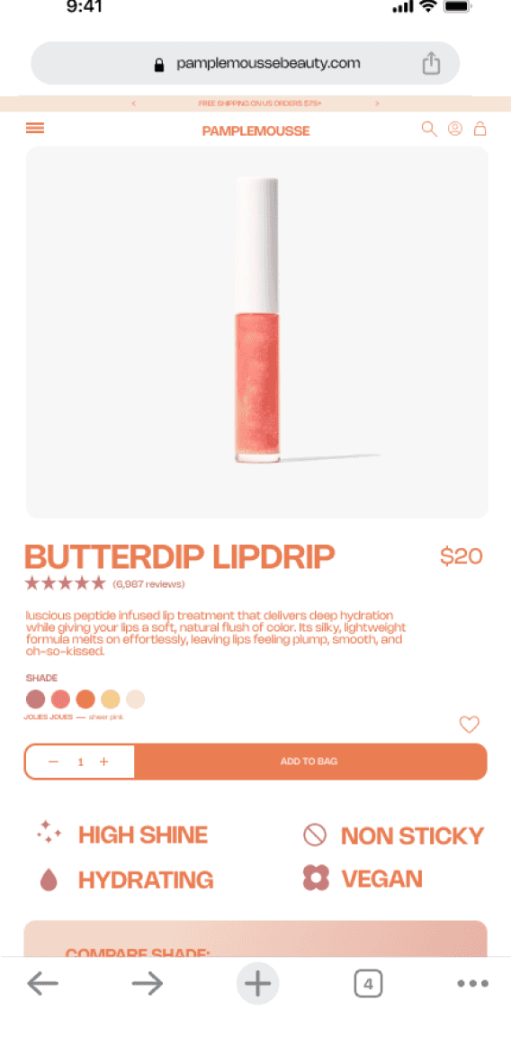
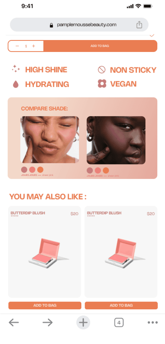
The layout was adjusted to reduce excessive spacing and make key features easier to scan. Quantity controls were added near the Add to Cart button, along with a favorite button so users can save products. A “You May Also Like” section was also introduced to help users discover related products while browsing.
The layout was adjusted to reduce excessive spacing and make key features easier to scan. Quantity controls were added near the Add to Cart button, along with a favorite button so users can save products. A “You May Also Like” section was also introduced to help users discover related products while browsing.
The layout was adjusted to reduce excessive spacing and make key features easier to scan. Quantity controls were added near the Add to Cart button, along with a favorite button so users can save products. A “You May Also Like” section was also introduced to help users discover related products while browsing.
Iteration 2
Iteration 2
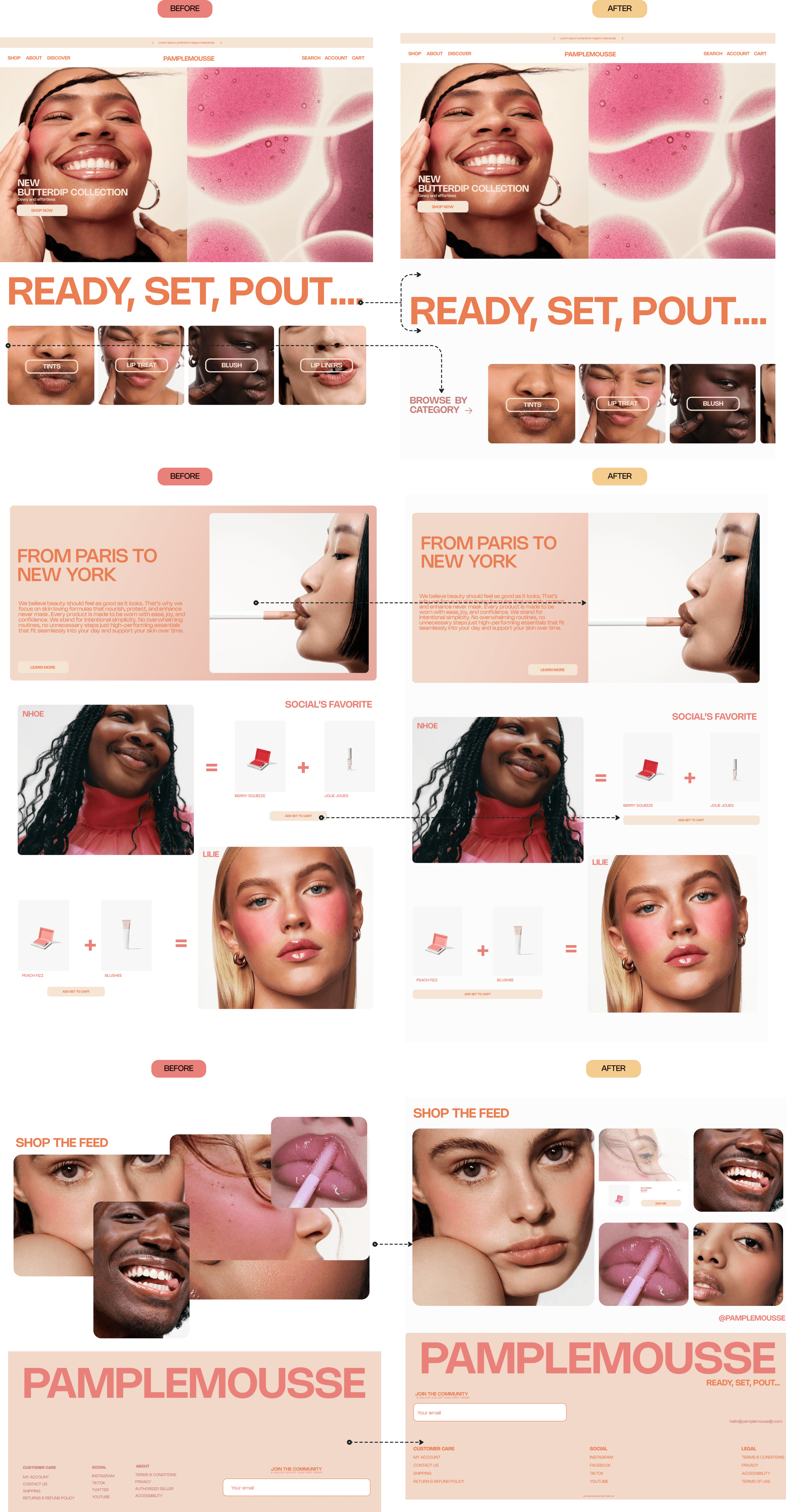
The social feed as well as the layout section was fully reorganized. The category section was clarified by adding a label and the footer was also redesigned to create a cleaner structure and improve access to key information.
The social feed as well as the layout section was fully reorganized. The category section was clarified by adding a label and the footer was also redesigned to create a cleaner structure and improve access to key information.
The social feed as well as the layout section was fully reorganized. The category section was clarified by adding a label and the footer was also redesigned to create a cleaner structure and improve access to key information.
Iteration 3
Iteration 3
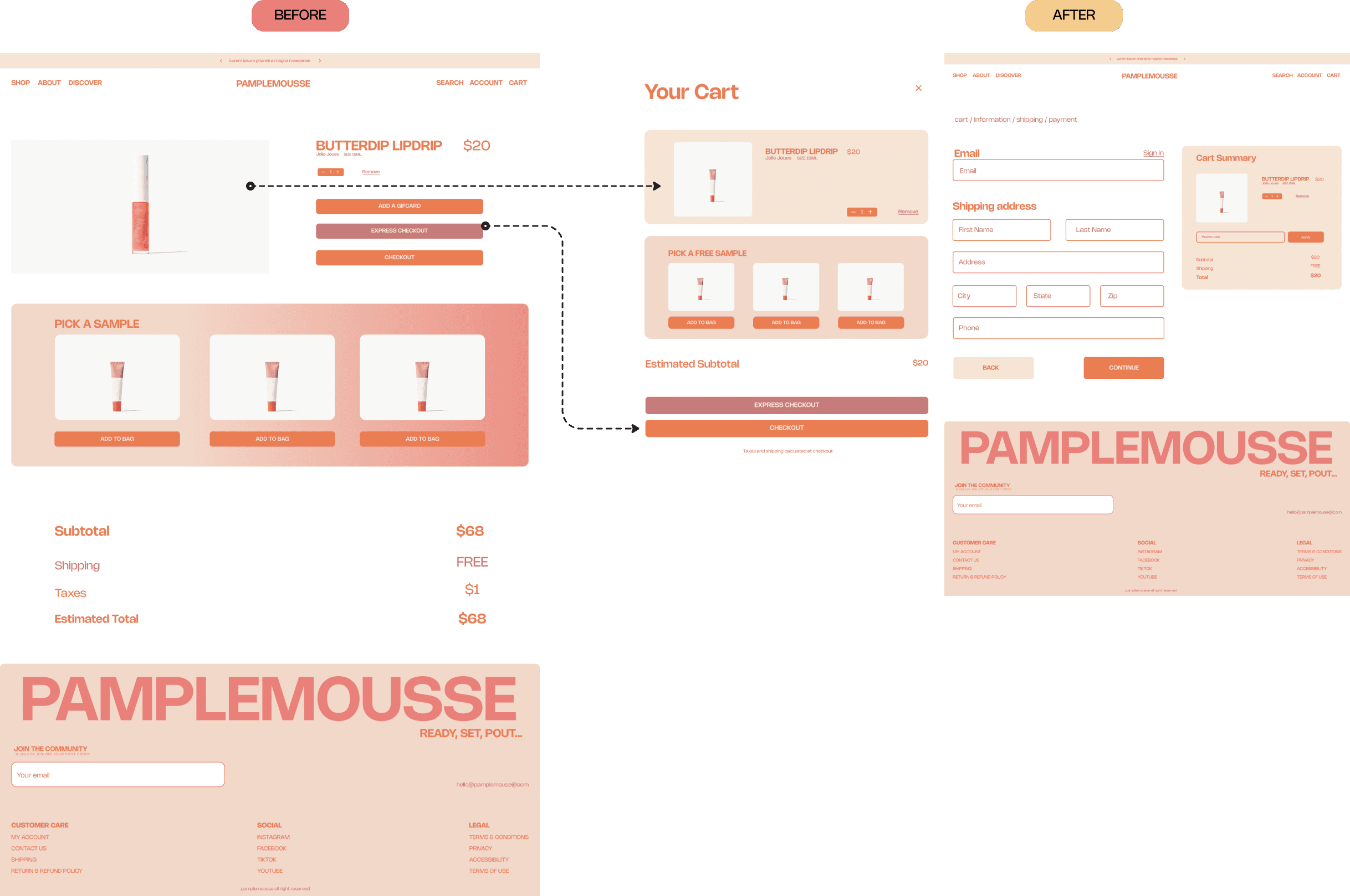
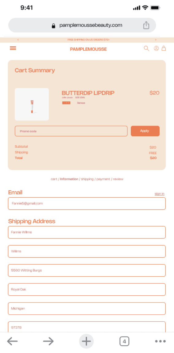
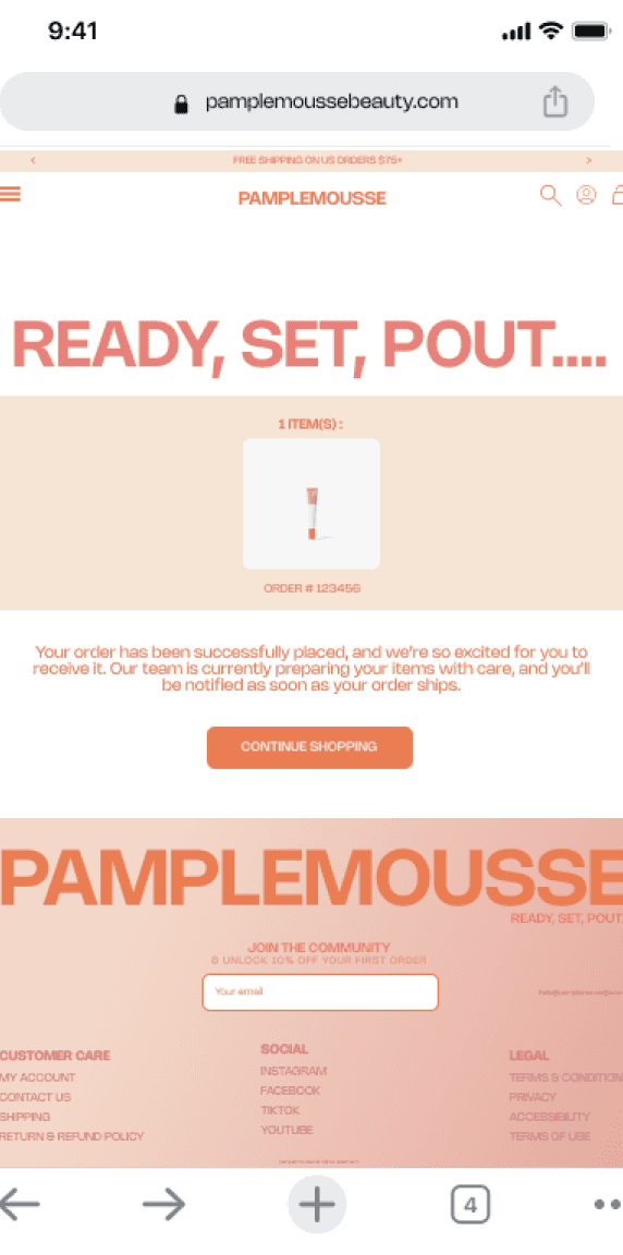
The cart experience was redesigned to create a smoother checkout flow. The layout was refined to clearly guide users from reviewing their cart to entering shipping information and completing payment.
The cart experience was redesigned to create a smoother checkout flow. The layout was refined to clearly guide users from reviewing their cart to entering shipping information and completing payment.
The cart experience was redesigned to create a smoother checkout flow. The layout was refined to clearly guide users from reviewing their cart to entering shipping information and completing payment.
Prototype:
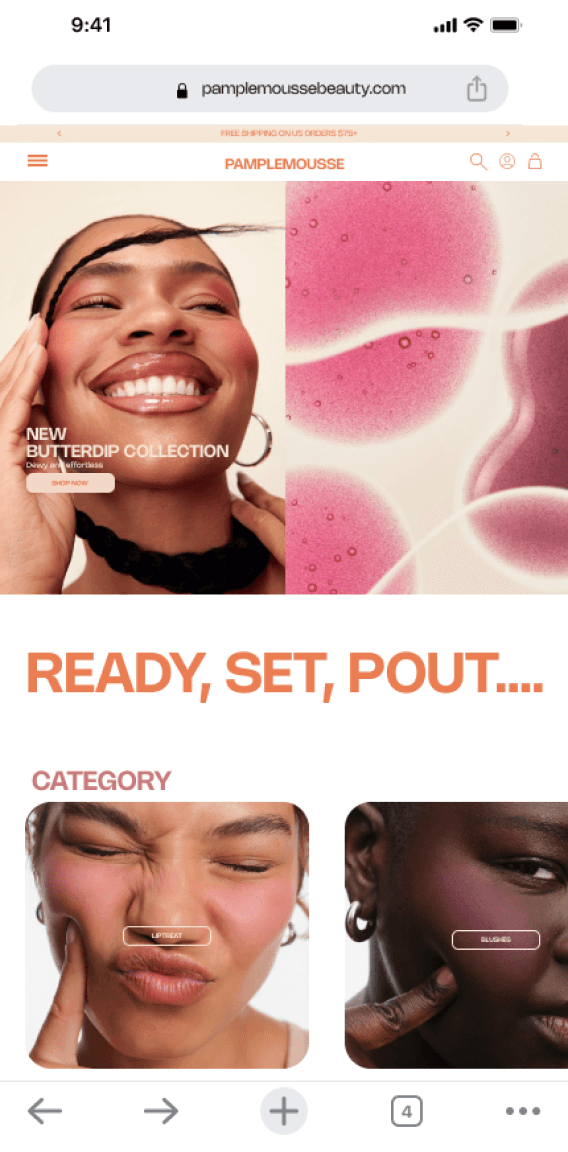
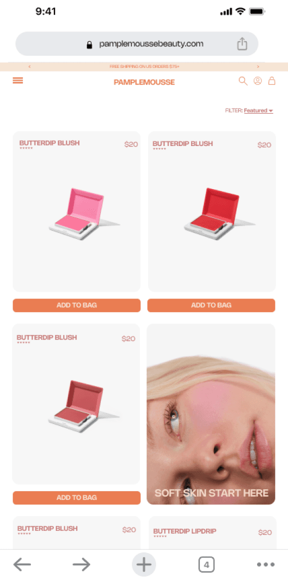
While i have only highlighted a few design iterations, the insights from usability testing were applied throughout the entire website as well as the mobile experience. The final design not only reflects the visual identity of Pamplemousse, but also offers a more thoughtful and intuitive shopping journey. From discovering products to completing a purchase, each interaction was refined to create a smoother and more welcoming experience for users.
Reflection
Reflection
Reflection
Working on Pamplemousse reminded me how important testing and iteration are in the design process. I learned that even small changes like adjusting spacing, clarifying actions, or improving hierarchy can make a big difference in how easily users navigate and understand a product. This project also helped me better understand how to balance brand identity with usability. I wanted Pamplemousse to feel visually expressive and memorable, while still offering an experience that feels welcoming, and easy for users to explore.
Working on Pamplemousse reminded me how important testing and iteration are in the design process. I learned that even small changes like adjusting spacing, clarifying actions, or improving hierarchy can make a big difference in how easily users navigate and understand a product. This project also helped me better understand how to balance brand identity with usability. I wanted Pamplemousse to feel visually expressive and memorable, while still offering an experience that feels welcoming, and easy for users to explore.
Working on Pamplemousse reminded me how important testing and iteration are in the design process. I learned that even small changes like adjusting spacing, clarifying actions, or improving hierarchy can make a big difference in how easily users navigate and understand a product. This project also helped me better understand how to balance brand identity with usability. I wanted Pamplemousse to feel visually expressive and memorable, while still offering an experience that feels welcoming, and easy for users to explore.
Get in touch
© 2026 Anne Tchoumba
Get in touch
© 2026 Anne Tchoumba
Get in touch
© 2026 Anne Tchoumba
Get in touch
© 2026 Anne Tchoumba